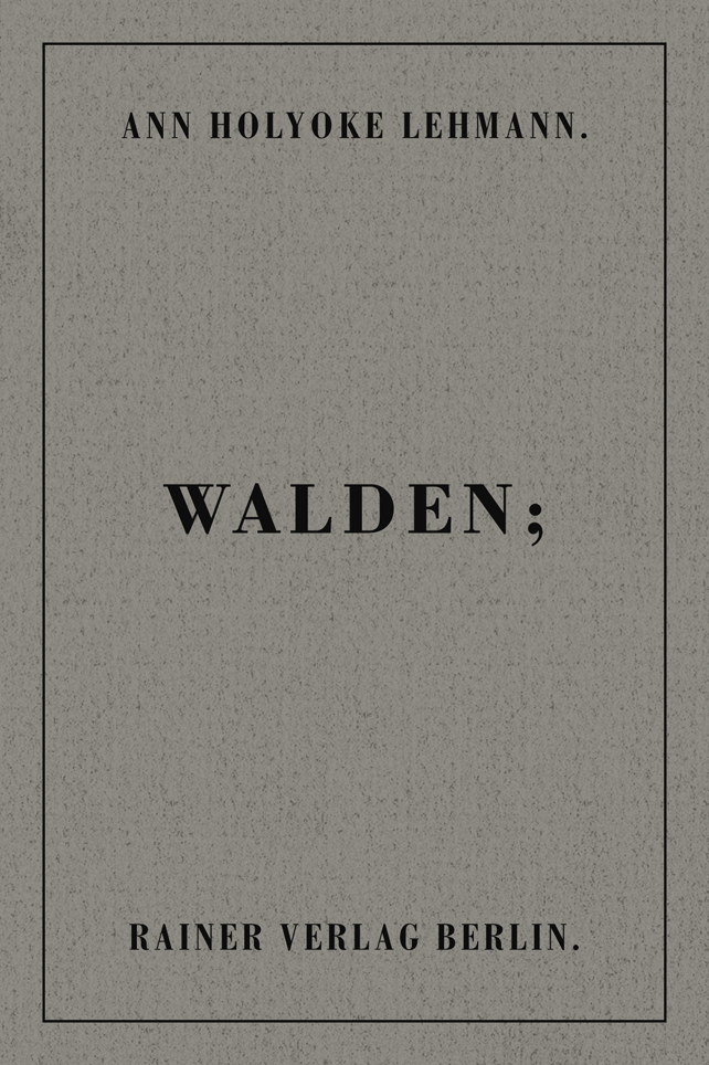
A N N H O L Y O K E . O R G | A M E T H O D O L O G I C A L C A T A L O G U E O F W O R K S
15 | W A L D E N
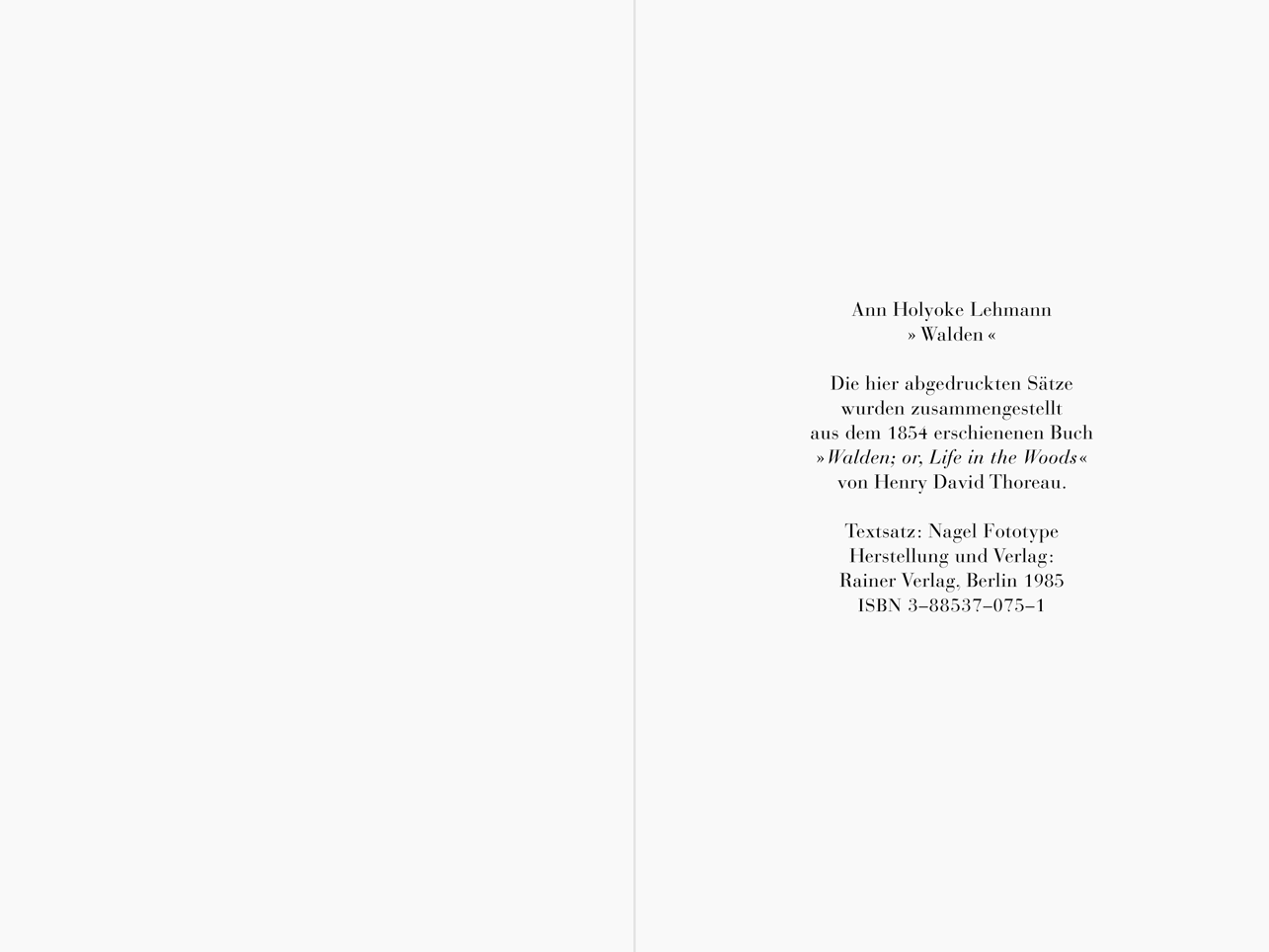
Bookwork, 1985
Offset printing (two-color)
124 pages, 15 x 10 cm
Rainer Verlag, Berlin 1985
Public and private collections, including the Walker Art Center Library’s Rosemary Furtak Collection, Minneapolis.
As a rule, books are held in the hand, or hands, and experienced at close range. Relatively unproblematic to circulate, they
are capable of reaching, in unchanged and unchanging form, a public virtually unrestricted geographically. They prevail, as does the written word per se, over time and space. Given the opportunity to create a book for
the Berliner Rainer Verlag, in late 1984, I was more than just a little pleased.
Rainer's husband and wife team published limited bibliophilic first editions
of original literature and art, from 1966 until not long after the Wall fell in 1989. They personally printed and bound these volumes, large and small, which were written and designed by authors and
artists of conceptual, even avant-garde, bent. I was
asked to develop an idea for their kleine Reihe (“small,” or “little,” “series,” or “program”), which, like their
larger-format “luxury,” hardcover series, collected works that offered insight into the genre of the so-called “artist’s book”: a book, that is, in which form, content, and materials
create a synergetic whole. (In an ideal world, this would, of course, apply to all books.)
The format of the books in that kleine Reihe was in the clear proportion of 2:3; yet, if not planned very carefully, measuring, as they did, but 15 x 10 centimeters each, the works in the series had a decided tendency toward the Lilliputian, in much the
same way as many CD-covers resemble miniature LP-sleeves. My ambition was not only to have my book’s design and typography allow this scale to seem exactly right in itself—that is, not to pose
the question of size—but to have the physical book-as-object be the key to a larger, spatial reality as well. In WALDEN—the first of three books I published with Rainer (due to its demise, a
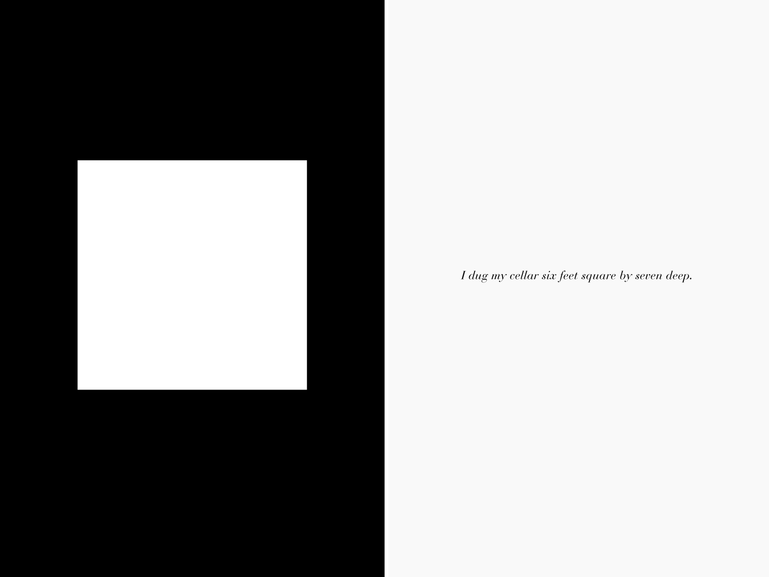
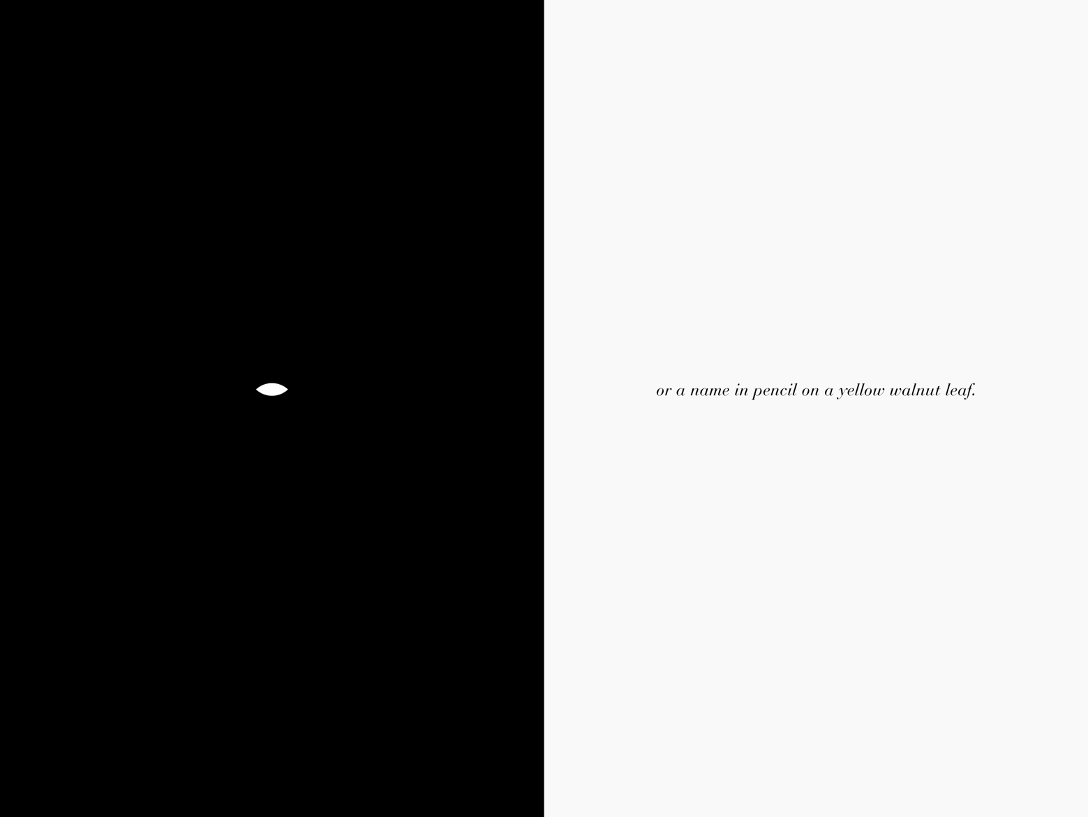
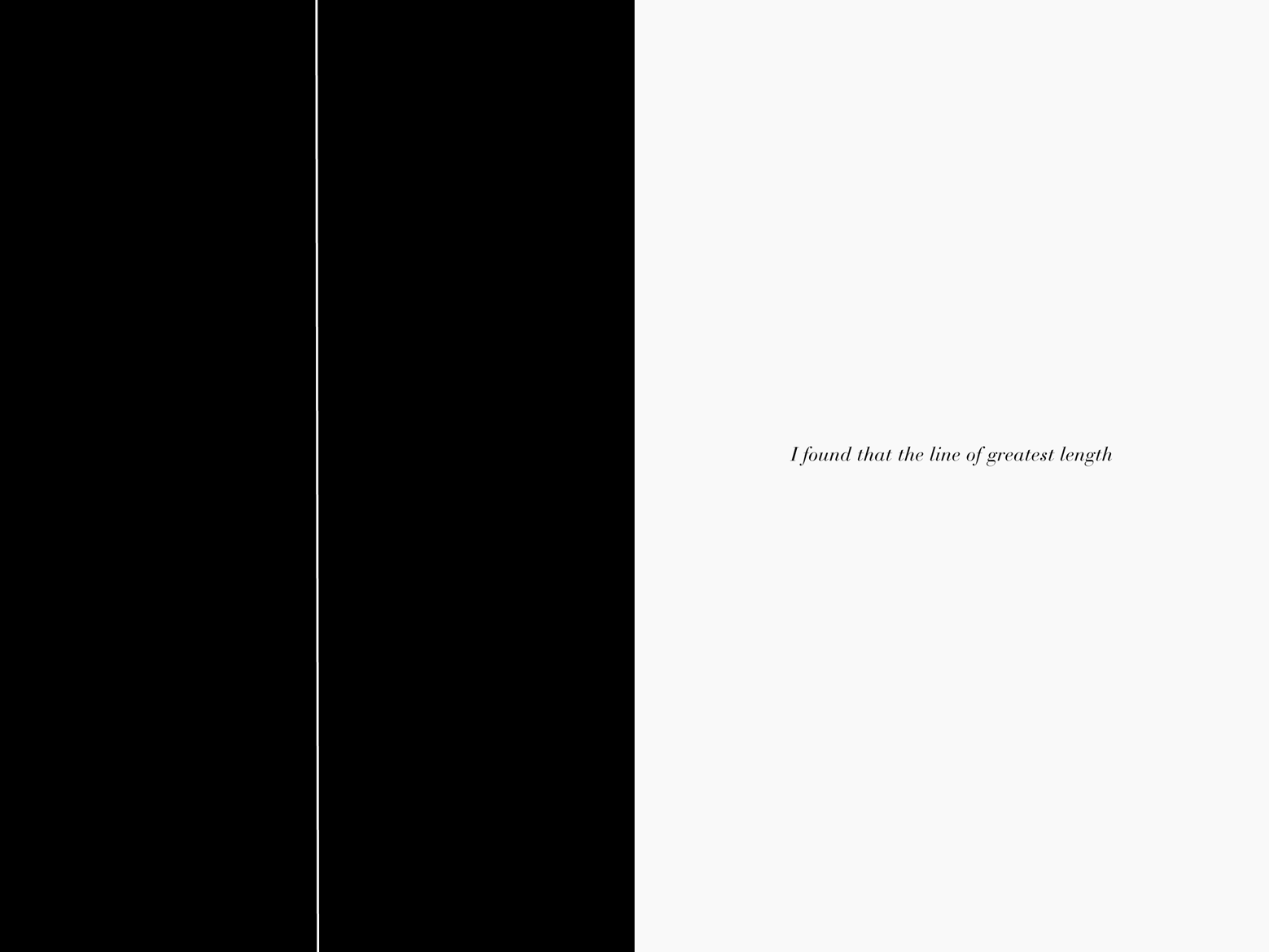
fourth remains unpublished)—I declared the left-hand page of each two-page spread to be a 1/30th-scale floor plan of the ten-by-fifteen-foot cabin Henry David Thoreau built in 1845, by the shore of Walden Pond,
which lies about fifteen kilometers from Salem, Massachusetts, as the crow flies, and just ten or so from Lynn.


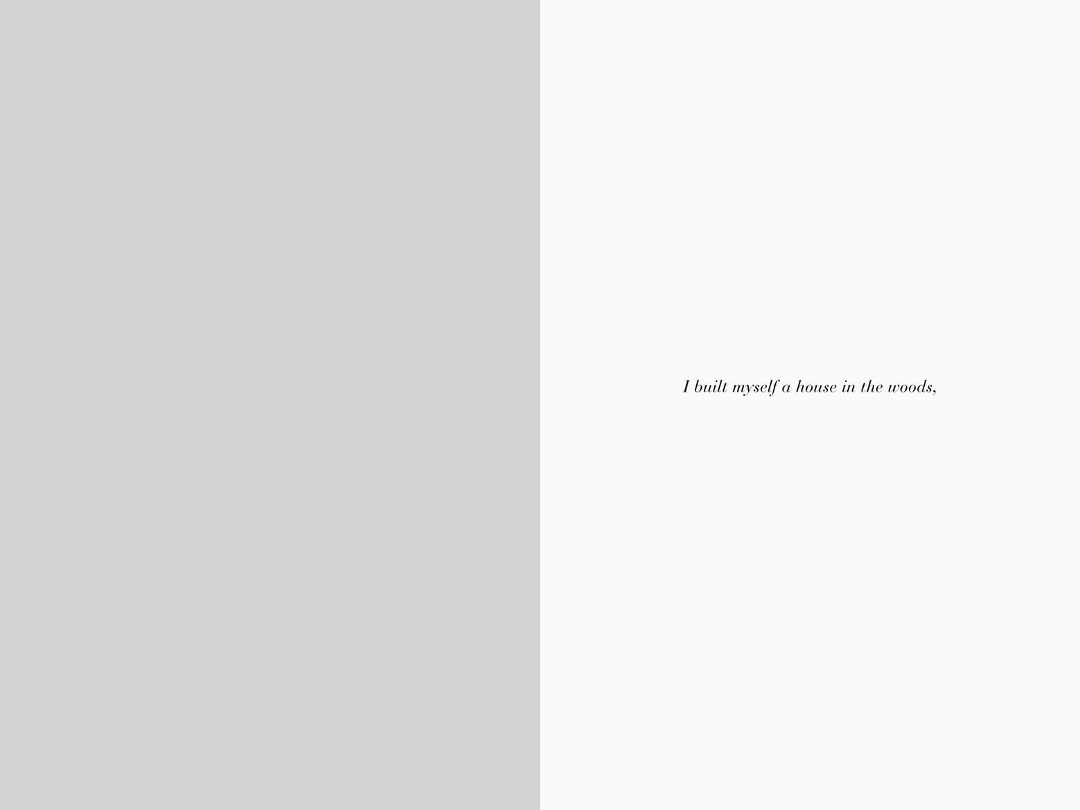
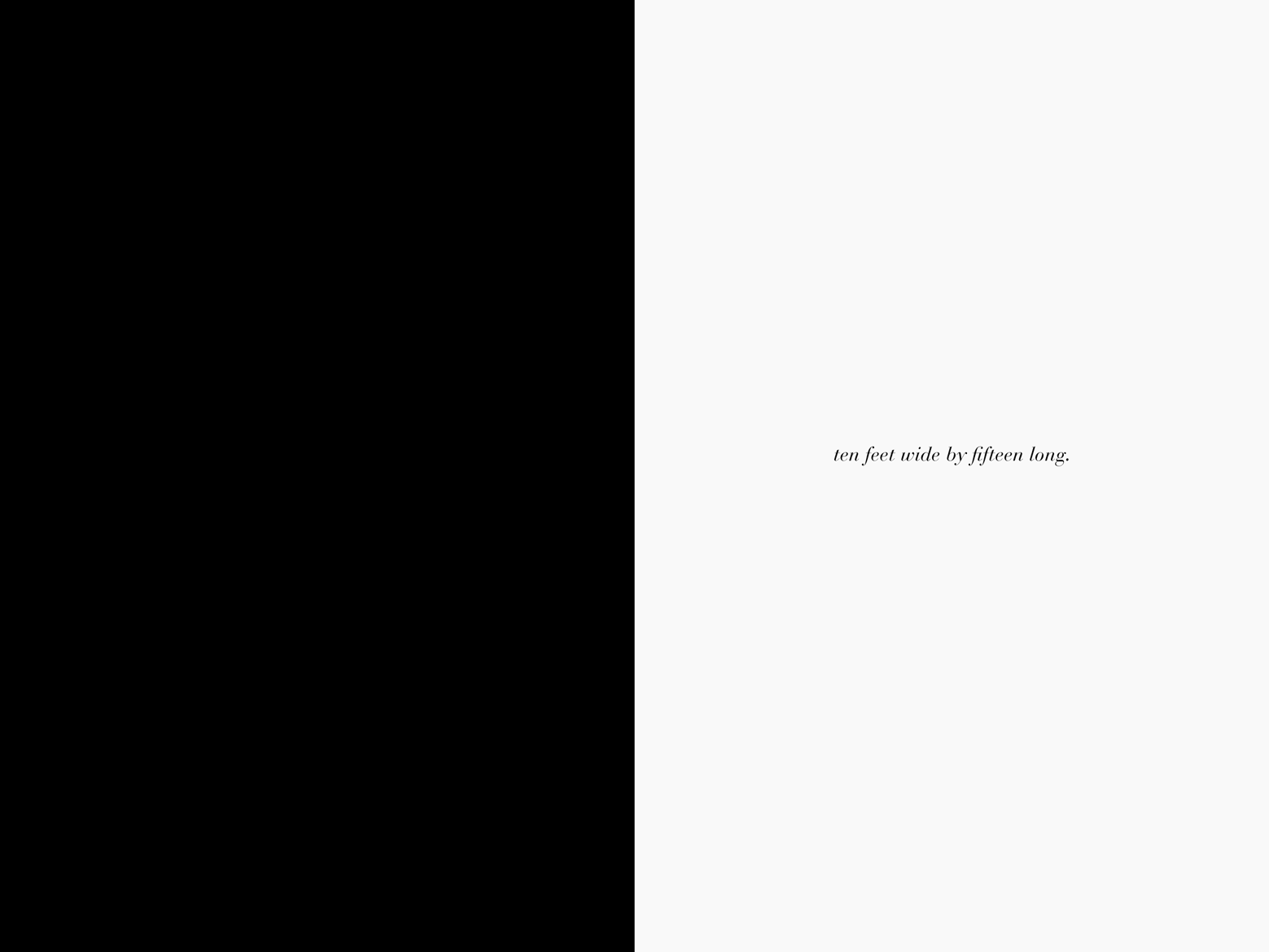


WALDEN, Rainer Verlag, Berlin 1985: cover and spreads [digitally redrawn and reset, 2018].
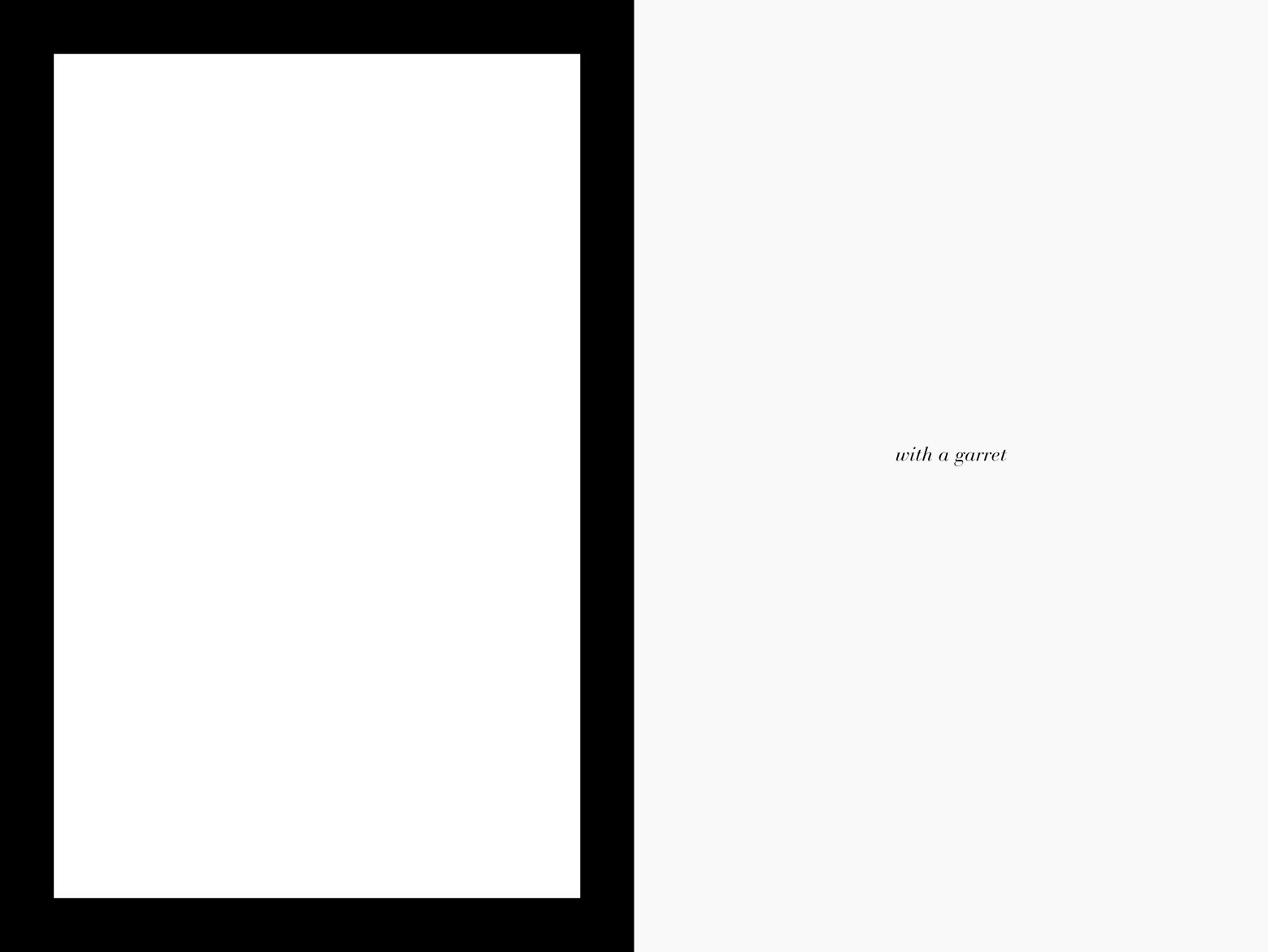
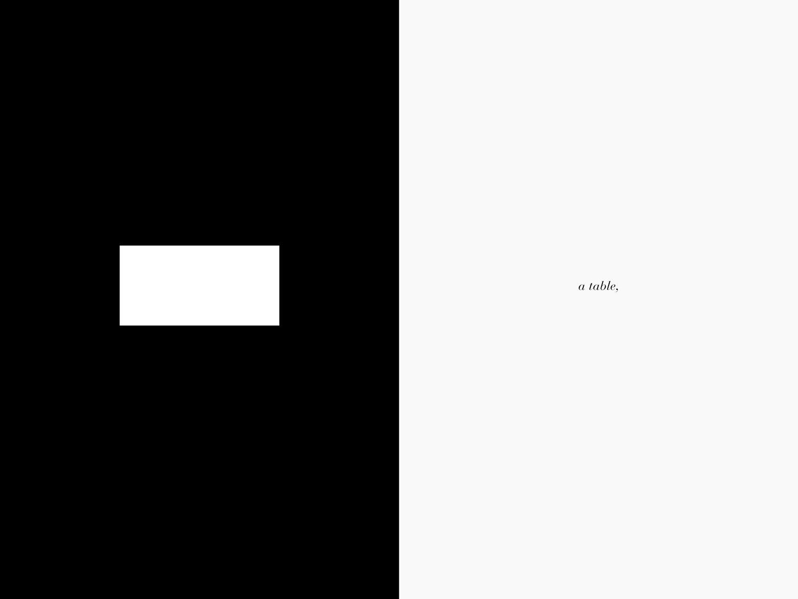
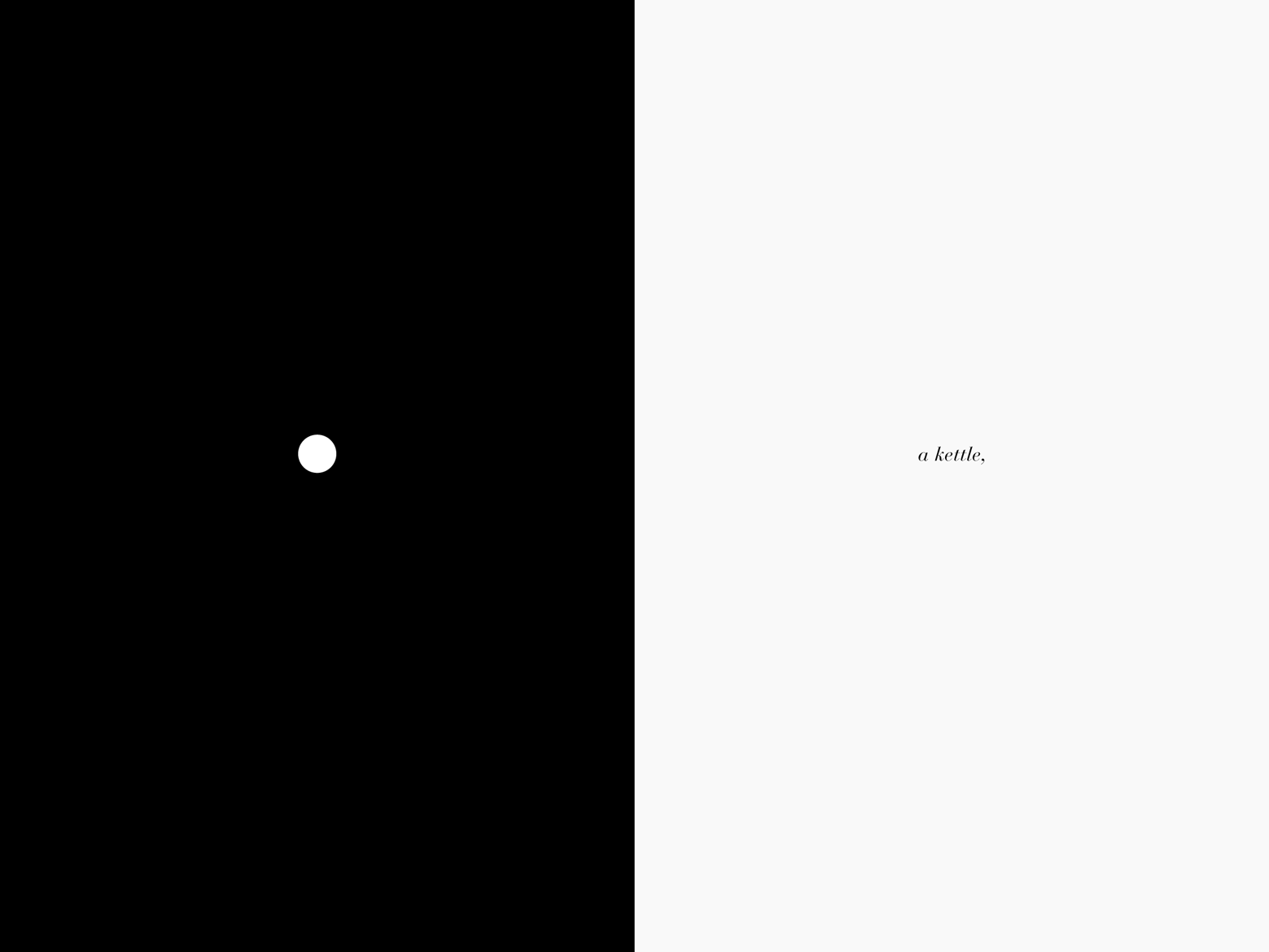
From the eighteen chapters of Thoreau’s Walden ; or, Life in the Woods, I extracted eighteen sentences, which were then phototypeset in an italic Bodoni font and printed, black on white, one line to each right-hand page. At first sight, these sentences have to do, very matter-of-factly, with the author’s building of the cabin, with its furnishings and visitors, a survey of the lake—I found, to my surprise, that the line of greatest length intersected the line of greatest breadth exactly at the point of greatest depth—and the dates and duration of his sojourn there. They describe, annotate, or suggest the interpretations of objects that appear—abstracted to white graphic symbols, and drawn to the same 1/30th-scale—on the black pages to the left of them.
One of these objects is one small book,* whose size I calculated by presuming it to be that of a volume in Rainer’s kleine Reihe, hence the small
book in the reader’s hand becomes a key to the actual dimensions of the little house that stood at Walden Pond and thus—by translating the more often virtual dimensions of reading into concrete, spatial terms—creates “reading room.”
____________________
* Here, in the digital version, this spread is corrected from the orignal publication.