A N N H O L Y O K E . O R G | A M E T H O D O L O G I C A L C A T A L O G U E O F W O R K S
27 | Z E I C H E N S A T Z : Gedichte zu Schildern
Book, 1997
Twelve three-color silkscreen prints
Twelve poems by Felix Philipp Ingold, printed in offset
64 pages, 24 x 17 cm
Münster, Kleinheinrich 1997
No. 8 in the series Arbeiten auf Papier [“Works on Paper”]
Private collections
Rare indeed are the moments when one’s own work appears redolent with perfection. I, for one, tend to brood over corrections and revisions long after it’s grown too late to make them. As a consequence, for me, a piece is never finished. Instead of putting the old ones right, however, I begin anew, with what I perceive to be a fresh idea, hoping this time to get to the root of the matter (which not only etymologically gives rise to the radical): to finally delve, that is, unmindful of self, so deep into my own subterranean core as to rub shoulders with the timeless. “Producing when identity is not” is what Gertrude Stein has said on the subject; Meister Eckhart called it Abgeschiedenheit, “detachment, isolation, or seclusion.” I, however, seem always to glance back over my shoulder, just before I reemerge into the light.
The torments of such chronic discontent can reach pathological proportions when one is dealing with a finished product of the printing press—a work, that is, which for all practical intents and
purposes can no longer be corrected. The book ZEICHENSATZ is, unfortunately, an all too good case in point.

Litfaßsäule, or advertising column, for CHOICE & CHANCE, 1993, at the Literaturhaus, Fasanenstraße, Berlin.
In 1993, Eberhard Blum and I devised an exhibit and series of events we called Choice & Chance for the Literaturhaus Berlin. While letting ourselves be talked into adding the unduly expository subtitle Aspekte der Entscheidung in Komposition und Vortrag (“Aspects of decision-making in composition and performance”), we chose as a motto words a legendarily idiosyncratic director of the Berliner Hochschule für Musik—now “University of the Arts”—once used to introduce a student concert: Sie werden sehen, was wir hören! (“You’ll see what we hear!”). The series’ flier promised “readings, film, music, and an exhibition mit Schriftbildern und Notenschriften—with lettering[s], writing[s], and notation[s], that is—by the authors and performers,” among whom were, apart from the two of us, John Cage, Felix Philipp Ingold, and Emmett Williams.
The English and German versions of my filmwork AEAEA were given their first showings in this
context, while my contributions to the small exhibition—in addition to the curating and designing of it—were materials dealing with AEAEA's graphics and texts, as well as the twelve-piece wall sculpture SIGNS. Hung on the walls of the small auditorium, this work was, like the AEAEA films, being shown in public for the first time. On one of the evenings, Rainer Pretzell, spiritus rector of his namesake Rainer Verlag, sat in the audience and
afterwards, in conversation with the Swiss poet and scholar Felix Philipp Ingold, waxed enthusiastic at the idea of publishing a book comprising as yet to be determined writings by Ingold and
reproductions of my SIGNS.


Designs of the twelve silkcreen prints in ZEICHENSATZ, 1997.
It goes without saying that I was more than pleased at the prospect of collaborating with both publisher and author—and correspondingly let down when, due to the decline and fall of the Rainer Verlag Berlin, nothing came of the original plan. In the end, Ingold’s and my book ZEICHENSATZ: Gedichte zu Schildern only saw the light of day, in 1997, thanks to a small publishing house, specialized in bibliophilic editions of poetry, literary prose, and art, in the parochial and prosperous university town of Münster—three and a half centuries after the Treaty of Westphalia had been signed there, ending the Thirty Years War… .
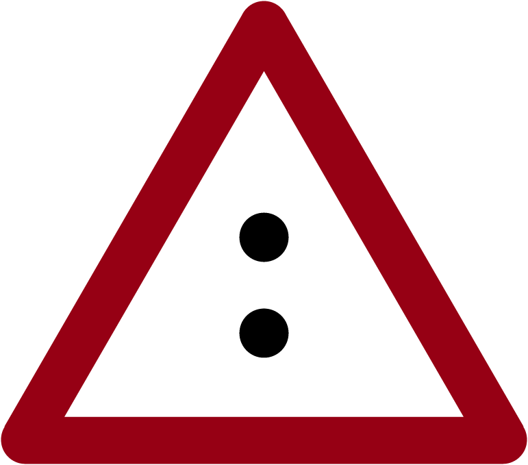
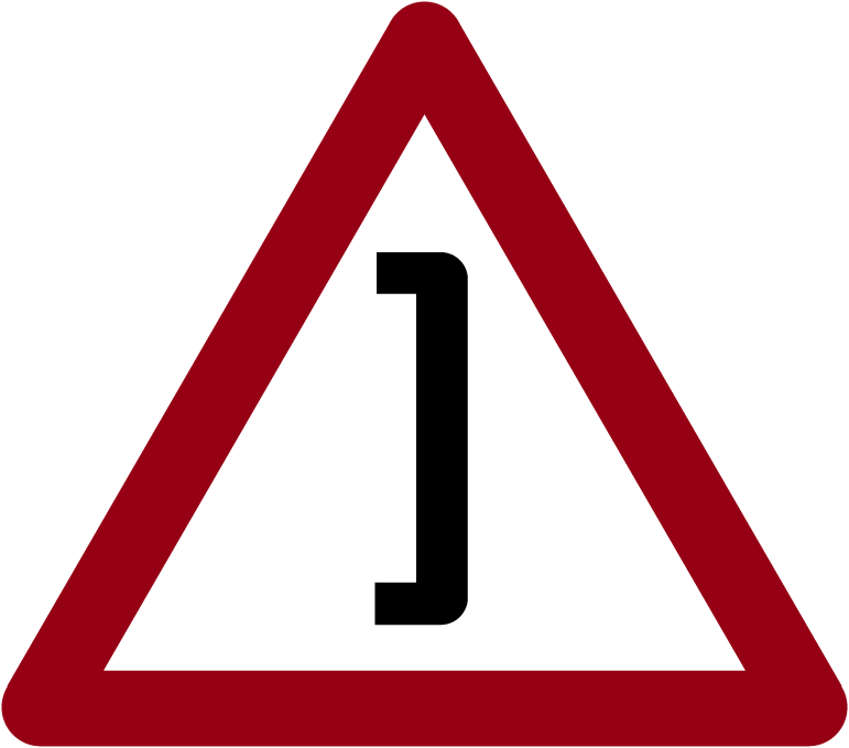
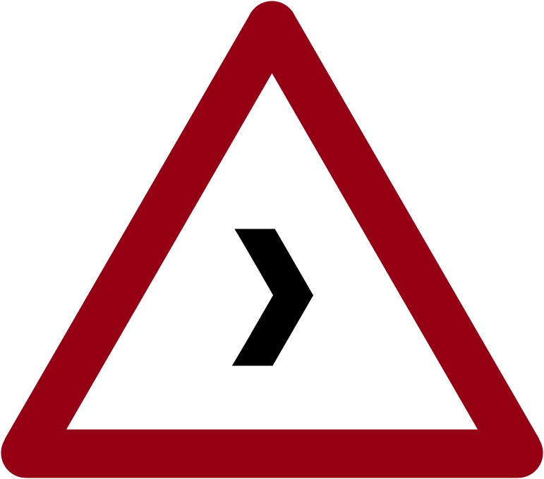
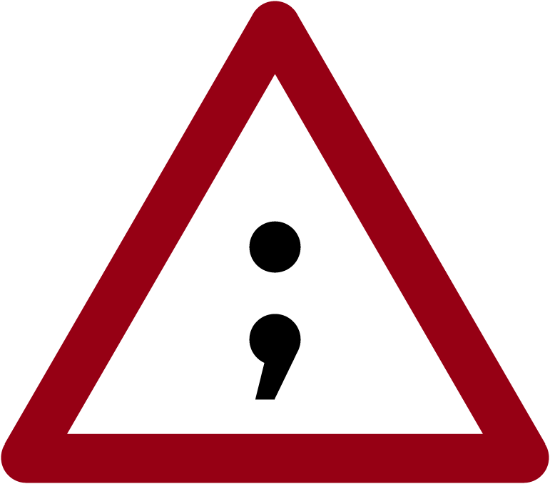
In the event, ZEICHENSATZ turned out to be a handsome little volume indeed, in which twelve silkscreen prints of my “rhetorical road signs,” redrawn to a scale of 1:12 with the original wooden
SIGNS, alternate with twelve poems by Ingold printed in offset, each of them punctuated using only the mark on the sign in question. But
while others may take pleasure in the attractions of the well- printed page and the sense of Ingold’s hand and voice the book contains, his and my pleasure remain blighted by a printing
error—always deplorable, but, in this case, actually sense-distorting and -diminishing into the bargain—that we both had overlooked when correcting the proofs.
*
The situation, i.e., that of eternal discontent, is much the same with regard to the sixty-odd designs I produced between 1990 and 1997 for CDs produced by the Swiss Label HatHut Ltd., primarily of music by New York School composers (a number of which can be seen directly below). On the one hand, decades later, I still find such purely typographical solutions were, and are, the best way of keeping CDs from looking like diminutive phonograph records; and I wouldn’t change a thing about the typeface itself—well, maybe one or two letters could stand a bit of a going-over— which expanded on the characters I’d drawn for SET (which, in turn, had been based on a familiar twentieth-century American font); nor, after a generous young friend created a digitized version of the font for me, do I regret not having had a computer at the time, as I prefer the results of the collage process I had to use—which involved, of course, a lot of photocopying, cutting out, and gluing—as I find it difficult to achieve the same typographic candor electronically; not to mention the gratification of discovering, from time to time, echoes of my covers in contemporary, twenty-first-century CD-design; and yet—on the other hand—I’ll never be able to look at a single one of mine without thinking: “Here, perhaps just a little more thus; and there, just a little less so…”. The clear-cut, uncluttered image consists of little more than detail.
[Click to enlarge an image.]