A N N H O L Y O K E . O R G | A M E T H O D O L O G I C A L C A T A L O G U E O F W O R K S
P R O L O G U E
Between late 1977 and early 1980—before, that
is, my work had taken a conceptual turn and my life with the musician and visual artist Eberhard Blum come to be measured in tens of years instead of months—I produced a series of drawings and collages that took a number of his flutes as their
various departure points.
The drawings are detailed black-and-white studies of the instruments, shown at from double to perhaps five times their original size, while the collages are color
blow-ups of the drawings and up to six or seven times again as large. In one of them, for instance, the tail end of a piccolo is portrayed at over thirty times its actual dimensions, thus bearing
a greater resemblance to a piece of obsolete machinery than to itself as a musical instrument. Influenced as much by the sequential thinking typical of what are now termed graphic novels, as by
the storyboards that were the stock-in-trade of the animated-film work I’d been doing at the time, each piece is divided into variously proportioned frames. Carefully cropped, these close-up
views depict segments of the wood and metal instruments’ head, foot, and body joints, with all their holes, keys, rods, and screws in place, and include, of course, reflections in their burnished
black and silver surfaces. Each may be regarded either separately or as belonging to the overall arrangement.
Marshalling a battery of well-sharpened graphite pencils, I employed the hatching and shading skills I’d been honing since my school days to execute the drawings,
whereas the collages were done in a novel technique specially conceived for the occasion—a method born of the necessity to produce the first group of these polychrome works, which were too large
to be done properly in pen-and-ink or colored pencil within the month or two allotted, while living in a furnished apartment with wall-to-wall carpeting: twin demands that meant having to
accomplish the work with a broad brush, albeit sans mess, in a clean, dry, paint-less medium.
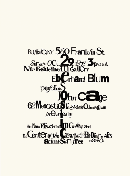
Poster for John Cage’s Sixty-Two Mesostics for Merce Cunningham, Buffalo 1978, 55.8 x 43 cm
I had begun the first drawings in Paris, when Blum had a residence grant there, in 1977. A year later, we spent the fall semester of the academic year in Buffalo, New York, where he continued his collaboration with the performers and composers at the university’s Center of the Creative and Performing Arts. Hence the furnished apartment. Early in our stay there, he asked me to design the poster for his Buffalo performance of John Cage’s Sixty-Two Mesostics re Merce Cunningham (which turned out to be a three-hour vocal tour de force during which, to judge by his post-concert commentary, Morton Feldman’s thoughts on very long pieces began to take concrete form).
The score of Sixty-Two Mesostics is a collection of sixty-two seemingly willful clusters of black letters, set in wildly varying fonts, notwithstanding that each group of letters comprised a word or word fragment, which had actually been organized around a mesostic (a “row down the middle”) of vertical type forming either the name Merce or Cunningham and painstakingly determined, using chance operations to choose each group of letter (from a book in Cunningham’s library) and its respective fonts. Having decided that the poster should also be designed according to similar principles—minus the chance operations and Cunningham’s library—I abridged the piece’s title to “62 mesostics” and had it serve as the design’s vertically aligned central row : the trunk, that is, from which eleven lines of type branched out asymmetrically, to either side, announcing the specifics of the concert and the coordinates of its venue.
But whereas Cage had had well over seven hundred different Instant Lettering® fonts at his disposal when he created the graphic constellations of his piece, my
initial enthusiasm was soon curbed by the frankly prohibitive cost of purchasing the amount of Letraset™ it would have taken to muster the mélange of typefaces required to spell out my poster’s
text. And so, in order to fashion a camera-ready image, I had to fall back on the technique traditionally employed in fabricating blackmail and ransom notes—applying it, however, within a rigid,
monochromatic, and licit framework. I cut the two hundred or so characters that I needed, letter by letter and numeral by numeral (together with the odd period or comma), out of magazines and
newspapers and mounted them on gridded layout paper.
In Berlin, a dozen years later, Cage himself commented that making the poster “must have been fun,” and, for all the
laboriousness of my modus operandi, I must confess he had a point. Today, however, such a process must seem bizarrely antiquated, if not downright incomprehensible, to those who have grown up
with an endless variety of digital fonts literally at their fingertips. Indeed, they may even be puzzled by the above reference to the luxury of being able to afford Letraset™—a product I was familiar with from my work in the film industry, where it had replaced hand-drawn or painted lettering, and was
itself being superseded by phototypesetting.
Shortly after this typographic episode had been brought to a satisfactory conclusion—though, admittedly, as nearly all of posters had disappeared long before the
performance could take place (presumably purloined to grace the walls of students’ dorm rooms), their advertising effect proved negligible—I attended a performance of Summerspace by the Merce Cunningham Dance Company, danced
to Feldman’s Ixion (Blum was playing flute), with “pointillistic” set design and costumes by Robert Rauschenberg. As I sat there in the dark, amidst the recently refurbished Gilded Age
swank of Shea’s Buffalo Theatre, an idea for generating the material I needed to produce my colored pictures with little mess—or at the very least without unduly imperilling the wall-to-wall
carpeting—suddenly occurred to me.
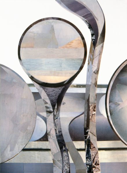
Bass flute I, 1978, printed paper on pasteboard, 70 x 50 cm
No doubt prompted by a contemplation of neo-Impressionist fundamentals, what I had in mind was a method related to the one I’d just used for the Mesostics poster insofar as this procedure would also involve culling material from magazines. I imagined that if I sifted through enough of them, I ought to be able to garner a palette of colors, shadings, and textures from the vast array of photographs reproduced in illustrated publications to render a composite image that was at once homogeneous and replete with new contexts and configurations. Carefully trimmed, fitted, and glued together regardless of their objective pictorial content, individual photo fragments might well reveal something of their original sources when inspected at close range, and yet rapidly coalesce when viewed together with their neighbors from a certain distance to express the forms and markings of the objects I intended to portray .
Theory became practice, and I found that my first group of nine “collage-paintings” had succeeded quite nicely. In fact, I hung them for the first time, when they
were barely dry, at Hallwalls Gallery in Buffalo, as the setting for an afternoon of solo performances by Blum, which we entitled “Audible and Visible Pieces on Flutes.” (The musical scores from
which Blum played—each with its own idiosyncratic system of notation—were also exhibited.)
Executed on smooth, white illustration board, with the enlarged section of the instrument articulated as a patchwork of glossy photo excerpts and the background
left untreated, or “empty,” those earliest, made-in-Buffalo flute collages have a distinctly graphic, even photographic, feel to them. Returning in Berlin, however, I decided I wanted to
emphasize the more painterly qualities of this collage technique, and began to do so by making my next pieces volumetrically more similar to oil- or acrylic-on-canvas paintings : giving them,
that is, greater physical mass, and thus more visual heft as objects, by replacing the thin pasteboard I’d been using with a fifteen-millimeter thick foam-core mounting board called
Depafit®.
But whereas this new material was light and practical, and did indeed lend my collages a resemblance to works on canvas and stretchers as far as their plastic
presence was concerned, the stiff, clay-coated paper of its surface was such an unattractive, lifeless shade of white that I felt I couldn’t leave it bare (as I’d been doing with the illustration
board), but would need to cover it completely with some material or other. Accordingly, as I combed through my stacks
of magazines hunting for scraps of color, light, and shadow, I collected material for this purpose as well, gleaning it in great abundance from “white” areas—areas, that is, that were devoid of
text and image. Such fragments did, however, each have a slightly different tint, and any printing on the back of the paper rectangles could actually sometimes be deciphered.
Two additional factors recommended such a uniform treatment of the board’s entire surface, one of them primarily aesthetic in nature, the other more obviously
technical. Both had to do with the fact that I had switched adhesives as well, having substituted nontoxic, water-based methylcellulose for the volatile, and hence pernicious, rubber cement I’d
so freely (and so foolishly) employed in Buffalo.
The first of these circumstances, the works’ looks, had to do with the fact that I was working wet-in-wet with a bristle brush, using what was basically wallpaper
paste : a method and materials that would have left an ugly halo of residue about the image proper had the background not been treated in the same manner. The second consideration was that,
whereas in concert with the paper and printing quality of the German magazines that were now the source of my photo fragments, the paste gave the surface a smoother, matter finish, the moisture
in it brought out the foam board’s inherent cussedness, namely, an exasperating tendency to warp and buckle at the slightest fluctuation in humidity. Papering the board’s entire surface, front
and back alike, went a long way toward counterbalancing this inconvenient attribute, but I only solved the problem caused by such mercurial contortions to my complete satisfaction when I switched
from foam-core to wooden blockboard.
Such technical disruptions aside, this convolute of drawings and collages represented the most rigorously conceived and
executed work I’d done to date. No doubt to a considerable degree, I owed this newfound perseverance to the fact that, almost from the start, these pieces had been planned as my contribution to
an interdisciplinary project concerning Theobald Boehm—the German inventor and musician who developed the modern concert flute that to this day bears his name—and slated for exhibition in
February 1980 at the Künstlerhaus Bethanien, Berlin. Devised by Blum as a collaboration between visual artists and musicians to celebrate Boehm as the eccentric nineteenth-century polymath he
undoubtedly had been, the project took place under the title “Theobald Boehm : Ein merkwürdiges Künstlerleben” [The remarkable life of an artist”], a title we borrowed from a contemporary account
of Boehm’s life and work ( whereby, in present usage, the German merkwürdig is more commonly understood in the sense of “odd” or “strange,” even “peculiar,” or “weird” ).
Our Boehm-Projekt encompassed an exhibition of art works and documentary material, as well as a series of concerts interlaced with lectures. In addition to performing and speaking on nineteenth- and twentieth-century music and musical practice, Blum coordinated the entire
effort, and I exhibited my drawings and collages under the subtitle Maschine : Flöte. This unaccustomed public exposure was by far the most extensive my work had yet enjoyed. It also
proved, at least temporarily, to be my representational swan song.
N.B. With today’s digital editing techniques, superordinate images are so readily produced from a miscellany of photographs, or photographic material, that they
border on the commonplace, whereas forty years ago, my collaged “pieces on flutes” seemed rather exciting. Dare I go so far as to say that they lent the term Photo-Realism an extra layer of
meaning? Nonetheless, having created them in my journeyman years, I’ve chosen not to deal with them in the catalogue proper of this website but here, in that catalogue’s prologue.
FLUTE WORKS, 1977–1980
BASS FLUTE, 1977
Drawing
Graphite on paper
48.5 x 61 cm
FLUTES, 1978
Drawing
Graphite on rag paper
69 x 57 cm
Private collection
PICCOLO, 1978
Drawing
Graphite on rag paper
69 x 57 cm
Private collection
BOEHM FLUTE, 1979
Drawing
Graphite on rag paper
69 x 57 cm
Private collection
FLUTE GROUP, 1978
Nine collages
Printed paper on cardboard [later laminated to retard decay caused by use of rubber cement as an adhesive, then mounted on
foam-core mounting board]
[Flute Group, 1978, cont’d]
Traverse Flute Nos. 1–5
Nos. 1 and 2 : 70 x 50 cm
No. 3 : 50 x 110 cm
No. 4 : 70 x 70 cm ( destroyed )
No. 5 : 70 x 70 cm
Bass Flute Nos. 1–4
Nos. 1 and 2 : 70 x 50 cm
No. 3 : 50 x 110 cm
No. 4 : 70 × 70 cm
Originally hung as a group measuring 210 x 230 cm
PICCOLO GROUP, 1979
Five collages
Cut-and-pasted printed paper, on foam-core mounting board
Nos. 1 and 3 : 60 x 60 cm
No. 2 : 60 x 72 cm
Nos. 4 and 5 : 90 x 98.5 cm
Originally hung as a group measuring 155 x 202 cm
Private collections ( Nos. 3 and 4 )
BOEHM FLUTE, 1980
Collage
Cut-and-pasted printed paper, on foam-core mounting board, 178 x 125 cm
Originally hung in three parts, each 59 x 125 cm, together 190 x 125 cm